Vertical alignment
Hi, I have a suggestion for the edit menu. I have just found how useful the vertical alignment is to adjust text from a LW worksheet in small gaps where the words appear too far down and aren't shown properly. By using the centre vertical alignment I avoid having to change the size of all the gaps.
However, I find the icons in the menu a bit confusing (that's partly why it has taken me so long to find out what they were for; the other part is that I'm not very clever).
I suggest replacing those icons with the ones on the right of the attached image.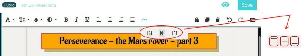
Answers
Hi Juan José,
We will look into this and replace them with more understandable icons.
Kind regards.
 Christian TopWorksheets 07/13/2023
Hi Juan José,
We have changed the vertical alignment icons to something more understandable.
Hope you like it.
Christian TopWorksheets 07/14/2023
I appreciate your efforts, but it still looks weird to me. Aren't the lines vertical in your icons? Shouldn't they be horizontal, but aligned at the top, middle or bottom of the box that we have drawn? Something like the attached image?

No, that should not be the icons, the text can be horizontally aligned to the left, center or middle, and that icons could be confusing.
The new icons are the default for vertical alignment, we are sorry that look weird to you.
Christian TopWorksheets 07/14/2023
Let me see if I can explain it another way. Here you can see what a text box looks like when I select the left horizontal alignment and the middle vertical alignment:

Do you see what I mean? When I select the fifth icon, the text doesn't look like your new icon, it looks more like the icon I suggested above, with two horizontal lines of text more or less in the centre of the box rather than at the top or at the bottom.
If you prefer your icon style, here's another suggestion, with the thin line representing the position of the text (top, centre or bottom):
